Dr. Berger responded to my post with another TweetStorm.
It starts here:
Dr. Topf's argument is summarized very well by his concluding paragraph. In short, there is nothing wrong in modeling estimated GFR based on "physiologic differences between the races."/2 pic.twitter.com/dvBSk77JYu
Update from January 2021: This is an old post and I have evolved my thoughts on this issue. I leave this here mainly as bread crumb on the trail of my evolving thoughts about this topic.
Zachery Berger published this epic tweet storm last week about estimated GFR. It starts here:
What a great question. Why do estimates of kidney function include different normal ranges for African Americans than non African Americans? Therein hangs a tale. (A thread to be intermittently updated between patients & work)/1 https://t.co/MKsU08oCfj
The conclusion is that using race in the MDRD formula (and by extension the CKD-epi formula) is inherently racist.
What have we learned up to now (well, I think many of us knew this stuff, but anyway): 1. Race is applied a priori without justification 2. Its definition is not specified 3. The definition can vary 4. It is ported into modern lab values/analyses without thinking/25
I do not think this is the case. Trying to estimate GFR from a serum creatinine and a few demographic variables is impossible, the best we can hope for is a reasonable guess. To see how bad we are take a look at the wide variability at high GFRs with the current CKD-Epi formula:
So that GFR of 60 has a 95% CI of being between 35 ml/min and 92 ml/min. Not so reassuring.
One of the primary reasons for this imprecision is that creatinine production varies from body to body. When one person produces more creatinine than another, for a set rate of creatinine excretion his serum creatinine concentration (what we measure on a blood test) will be higher. Who produces more creatinine? People with more muscle mass.
Larger people produce more creatinine than smaller people
More muscular people produce more creatinine than less muscular people
People with four limbs produce more creatinine than people with 3 limbs
Men produce more creatinine than women, on average
Young people produce more creatinine than older people, on average
Even though Dr. Berger did not draw the conclusion that estimated GFR is inherently sexist, let’s look at gender first. I have recolored the two graphs and superimposed them on one another. Men are in red and women are in blue:
It is clear that for any given GFR the men tend to have a higher creatinine than the women. This is not perfect and it is not hard to pick out individuals where this generalization fails, but in general this is a fair generalization. Levey comments and quantifies this gender difference:
At any given GFR, the serum creatinine concentration is significantly higher in men than in women (P 0.001).
The figure, without any recoloring, provides the curves for black (solid line) compared to non-black (dotted line) patients. Again it is clear that the average GFR is higher for black patients at any set creatinine. Levey comments and quantifies the racial difference:
At any given GFR, the serum creatinine concentration is significantly higher in men than in women and in black persons than in white persons (P=0.001).
Dr. Berger misses this fact:
Interesting: how do we know *that* to be true? Three references are given: Cohn 1977, Harsha 1978, and Worrall 1990. Let's go down the memory hole (for a scientist, 1977 is OLD)./17 pic.twitter.com/8Fn77B3j6G
How do we know *that* to be true? BECAUSE THEY MEASURED IT!
The refernces are just there to show that this is not a new and novel finding. This was an expected finding. The study does not rest on these references. The investigators in the MDRD study measured the serum creatinine, GFR, and asked patents if they were white, black or hispanic. The data shows that black people had, on average, 18% higher GFR for any measured creatinine. The fact that the prior work on this subject was deplorable does not alter the findings.
Berger is so upset that the estimated GFR differentiates black and white people that he misses the real problem with the MDRD study, the embarrassing lack of black people in the original data set. Only 12% of that cohort was African American, less than 200 people. A group that has the greatest incidence of end-stage kidney disease should be over-represented in a study about reducing the progression of CKD, not under-represented. Remember, Levey was using the data already collected for the Modification of Diet on Renal Disease study. This was not de novo data collected for the purpose of generating this equation. This weakness was corrected in the CKD-Epi equation where there were nearly 3,000 African Americans representing 30% of the cohort. The adjustment for race went from an 18% bump in GFR for a given creatinine down to 15.9%. Not much difference.
We use race, gender, and age not because we are racists, sexists, and agists, but rather because there are physiologic differnces between the races, the genders, and the aged. We exploit those differences to improve the accuracy of our estimate. All of these adjustment are just attempts to use demographic variables to squeeze a better correlation of GFR from a serum creatinine.
One of the things that is intoxicating about social media is watching how many people see, interact and respond to your content. This is at the heart of the difference between the little red circle on Twitter (dopamine!) versus the the little red circle on Mail (dread!).
Tracking likes and Retweets
The simplest analytics are shown below the tweet and anyone can see them.
This tweet from new NSMC intern Dr. Dave has 5 retweets and 28 likes.
Impressions and Engagements
The next level of analytics can only done one’s own tweets. Select one of your tweets, preferably one with a picture or a link, or both, and press “View Tweet activity”
This opens up a panel that reveals two new analytics: Impressions and Total engagements.
Impressions are a bit confusing. Here Impressions represent the number of people the Tweet was actually displayed to. So someone that was scrolling through twitter and this tweet passed her eyes would add one to the impression. This is very different than how that same term is used by Symplur (see below).
Engagements are the total number of people who have interacted with the tweet in some way. Click View all engagements to see what that means.
Twitter does a nice job of tracking and breaking down the elements that make up engagements.
Analyzing Your Twitter account
The next level in analytics is looking at your twitter account. Make sure you are logged into your twitter account on the web and then type in https://analytics.twitter.com
The analytics page has an explosion data. The top gives you your 28 day trend for Twitter.
January is not looking like a good month for me.
There is a menu of additional pages of information. The only one that I find useful is Tweets. More on that later.
Scrolling down you see a summary of every month you have been on Twitter Actually I’m not sure how far it goes back, but pretty far. For each month it tells you:
Your Top Tweet. The tweet from that month with the most impressions
Your Top media Tweet. The tweet with an embedded picture, video, gif, or poll(?) with the most impressions (if your Top Tweet has attached media, the Top Media Tweet will be the tweet with the second most impressions)
Top Follower. The Twitter account that followed you that month with the most followers. Some of my months don’t list a top follower. I wonder if that is because that person no longer follows me? (And no I don’t know why Follower is capitalized)
Top mention. The Tweet that mentioned you that garnered the most impressions that month.
Nothing dispels the notion that number of followers translates to interesting person faster than scrolling through your history of Top Followers. They are rarely someone interesting. Not you Soledad, I think you are very interesting, I’m talking about other people.
Next to these four pieces of information is a summary of your use of Twitter that month. I find it interesting to scroll through and see how your Twitter activity climbs and falls month to month.
Now click on Tweets at the top of the page (between Home and Audiences)
At the top Twitter shows you a histogram with the number of tweets (grey) and impressions (blue). On the right rail there are a series of histograms with the daily count of some of the components that make up engagements.
The bulk of the page is a collection, in reverse chronologic order, of all of your Tweets for the month. If you want to look at another time period you can do that with the date picker in the top right corner of the page. For each tweet you can see impressions and engagements and the rate (engagements/impressions). For each tweet you can click to reveal the full breakdown of engagements. You can sort and filter the list by pressing Top Tweets and get a short list of your top Tweets.
There are a few more tabs to explore in Analytics, but I have not found them useful.
Hashtag Analytics
At the end of every #NephJC and #AskASN, Matt and I race to see who can post the analytics for the chat first. To do this we are taking advantage of a service called Symplur. Symplur tracks all health hashtags. If you come up with a new health hashtag for a conference, you should go to Symplur and register that a hashtag. To use Symplur, go to their homepage and click on the magnifying glass and enter your medical hashtag.
Then click on #NephJC in the search result page. This take you to the #NephJC page in Symplur.
Ignore the schedule in Symplur, NephJC moves around inside the month enough that they never have it right. To get the Symplur analytics for an event you need to scroll to the bottom of that page, use the date picker to select the time you are interested in and press Get Analytics.
This will give you the analytics for that time period. Here is the analytics for the ACC/AHA Hypertension chat on January 16th.Mentions is the number of times a person on Twitter was mentioned along side the hashtag in question (#NephJC in this case). Tweets is the number of tweets composed by the individual which contains the hashtag. And then there is Impressions. These impressions are not the same as the impressions that Twitter tracks. Twitter impressions are real. Symplur impressions are a lie. Symplur impressions are the number of tweets multiplied by the number of followers the author has. Since I have 11k followers, each of my tweets increases my impression count by 11k. Impressions rack up gaudy numbers fast and often a larger conference will have impression counts in the 100s of millions. This is absurd. Do not believe impressions. Matt and I, when we tweet the analytics for the chat, edit out impressions. However in one of our publications we did publish impression counts for NephJC. Matt swears it wasn’t him and I swear it wasn’t me but it’s in there. Sorry.
Good 2 know. Impressions don't have a primary place in #SoMe Best Practices. Your recent 2/2017 paper gives a different portrayal pic.twitter.com/S1WhD5J2uM
That’s the basics on Twitter analytics. A number of people have developed more advanced analytics that you might want to explore but I have not found that they add much witter experience. This is enough for me. Your mileage may vary.
Social media in health care is a fascinating and rapidly mutating field. One of things that makes it so interesting is that just as we start to master one set of tools, new ones arrive. Twitter is the latest tool to catch fire in the Healthcare Social Media arena. The real time nature of Twitter and the ability to have conversations with colleagues around the world is one of the most globe-shrinking experiences in which I have ever participated.
Twitter is great for exchanging single ideas and single sentences, but as the thought becomes more complex, the elegance of Twitter breaks down. People are forced to send tweet after tweet to express an idea. As the tweet stream begins to lengthen, it should becomes obvious that Twitter is not the right tool for the job. We do not live in a world with only hammers.
The quintessential example of this is the trend to “Live Tweet” meetings. Sometimes this is appropriate. For example when the meeting contains breaking news. This happens at the Late Breaking Clinical Trials session at Kidney Week. Here the presenters are providing the world with its first glimpse at new information. I remember live tweeting the Bardoxolone results 6 months before they were published in the NEJM. That however is not what we tend to see with people live tweeting a meeting. Usually it is a string of hopelessly unintelligible tweets trying to express the words, images, references and ideas of a presenter in 140 characters (actually it is never 140 characters because no live tweet is complete without the obligatory meeting hashtag, #KidneyWeek12)
I have heard people defend live tweeting as a way of keeping notes for a meeting. It’s great that you are taking notes but if you think that twitter is as good way to archive information, you must be new here. Old tweets regularly disappear from the Twitter database or become functionally unobtainable within a few weeks. Writing your notes on the back of a business card that you stick to the coffee house bulletin board would be a more reliable way to archive your thoughts. Additionally, if you are taking notes, why go through the overhead of parsing them into 140 character thoughts and posting them?
In the end, live-tweeting a meeting seems intellectually lazy. I think it is great for participants to take notes, think about the speakers and post their summaries or conclusions to the internet. I just feel that Twitter is a terrible way to do it. If you want to post longer thoughts, careful notes or thoughtful conclusion, it sounds like you might like blogging.
On the other hand if you want to make snarky side comments about the use of Comic Sans in the presentation Twitter is the perfect tool.
Pot meet Kettle. Kettle meet pot: I have agreed to live Tweet Med 2.0’12 in September for eAJKD. I am going to try and filter my tweets and use the tool rationally. I want to pair a modest bolus of tweets with short individual posts for each session in which I participate.
It was dramatic and there was a lot of buzz among the kidney folk on Twitter about this. You can read some of the coverage here. It was exciting but it tasted too much like a publicity stunt for my taste. The counter argument, of course, is that raising the profile of living unrelated donors increases the likelihood that people will come forth and donate and I should just swallow my distaste and be supportive of the outreach effort.
We need more living donors.
We need more deceased donors.
We need more kidney donors.
As part of the Twitter publicity campaign, IU_health tweeted various facts about transplant. This one seemed wrong to me:
One every twenty minutes
Three an hour
Seventy-two a day
26,280 deaths a year
That’s a lot
That’s too many
When I first read the tweet I read it as “1 American dies every 20 minutes waiting for a kidney transplant.” Twenty-six thousand deaths out of the ninety-thousand people on the wait list seemed like a very high mortality rate, higher than the dialysis morality rate. A quick check in the USRDS Atlas revealed the mortality rate to be only 7% on the wait list.
When I went back and read the tweet again I saw that they were talking about people waiting for all transplants. This seemed more than a bit disingenuous because when we encourage people to become living donors we are only talking about kidney transplants (in 2008 there were only 250 living partial liver transplants). I assume that IU is not encouraging living donors for hearts and lungs.
In 2008 there was only 4,638 deaths among people waiting for a kidney transplant. For all organs it was only 7,182 deaths. These numbers are from Health Resources and Services Administration. Similar data can be found in USRDS Atlas Volume 2 Chapter 7 (PDF).
We need more kidney donors and social media is a great tool to unlock the thousands of spare kidneys Americans carry around with them but the great need does not justify spreading lies and misinformation.
Literally minutes after I posted this I received the following tweet:
Kudos for IU Health in coming clean. Also Hat tip to Sunny Gill, one of our first year fellows for finding the HRSA website.
This was cool because a famous author had noticed our exchange but in retrospect it seems to be standard social media marketing, track your mentions and regard your fans. But moments later it turned deeper, and dare I say, weirder:
Now, I agree that Kidney boy does sound like a lame, super-hero side-kick, created by a large dialysis organization for an in-house comic book to give to pediatric patients. But I never imagined that a super-star writer would be creating my costume.
I remember thinking, “What is she talking about? She can’t be serious.”
This has been wonderful and exciting. How cool is it to exchange with an author I love and respect. It demonstrates how small the world can be. Everyone go out and read Margaret Atwood. She does a great job of looking at where the world is going and extrapolating it forward into a unique, detailed and terrifying future. Start with Oryx and Crake, but I liked The Year of the Flood better.
Update
Ms. Atwood took her time but months after this exchange she tweeted the fully colored version:
Update 2. This incident ended up getting world-wide attention. Here is an article in The Guardian. Comics alliance cover it. And the artists from Periscope studios were even inspired to create their own versions of Kidney Boy and Dr. Snit.
Update 3. What happens to your traffic profile when you get a link from the front page of the World section of the Guardian?
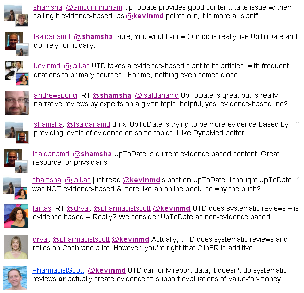
A few months ago medical blogger Laika wrote an insightful blog entry summarizing a meme which had been bouncing around twitter regarding whether UpToDate was evidence based medicine or some other entity.
I found the whole excercise to be a bit too philosophical for me. Regardless of what you call it I think everyone would agree that UpToDate is useful. It is a great starting place but usually insufficient as a single source.
I was reminded about it today when I came across this paragraph:
In the card on “Clinical manifestations, diagnosis, and natural history of primary biliary cirrhosis.” (Link for subsribers)
Regardless of the merits of UpToDate, nothing breaks the illussion of evidence based medicine like an author throwing out a random statistic like “approximately 15% of the 1,200 patients who I have seen…” without a reference. This is the epitome of expert oriented experiential medicine and has no place in EBM.
The tweet reads, “It annoys us at The Kidney Group when so-called experts claim being well-hydrated is overrated and without much merit. Completely untrue.”
The fact is this is total bullshit. Outside of patients with kidney stones or pre-renal azotemia, I am aware of no human data showing improved kidney function from increased fluid intake. In fact in the MDRD study they found an association with high fluid intake and faster progression to dialysis. Having a 24-hour urine volume of 2.4 liters was associated with a loss of kidney function of 1 ml/min/year faster than patients with a urine output of 1.4 liters.
In a comprehensive study on the risk factors for the development of ESRD (PDF) (27+ years of follow-up of 177,570 patients) having nocturia (HR 1.36) was about as important a risk factor as anemia (HR 1.33) or family history of kidney disease (HR 1.40) on multivariate analysis.
The authors take on the significance of nocturia:
It is interesting that nocturia (defined herein as self-report of “always having to interrupt sleep to urinate”) emerged as an independent risk factor for ESRD because it is a widely held clinical belief that nocturnal polyuria is an early sign of chronic kidney disease due to decreased urinary concentrating ability, although some data suggest that increased salt, not water excretion, is more important. Therefore, nocturia may reflect subtle early renal disease not captured by serum creatinine level or urine dipstick analysis. We also cannot exclude the possibility that nocturia reflects undiagnosed DM. An alternative hypothesis is that nocturia reflects a high volume of ingested fluid that is detrimental (especially among patients with existing kidney disease), as high urine volume increases intratubular volume and pressure and these stretch forces induce fibrosis. Practically speaking, our data lend no support to the notion that a high volume of water intake should be recommended in clinical practice as being beneficial to kidney function.
For a summary of the myth of water intake and kidney health look at this excellent review by Wenzel et al in CJASN (PDF).